User Research, Problem Solving, Designing with a Team
by Savannah Redlinger AJ Carter, Tianxiao Liu (Sharol), & Shanley Corvite
This is a project that I collaboratively designed from the initial problem statement to the final interactive prototype. Here is a description of my teams’ design process from end to end.
My team is part of a greater research team, head by Professor Oliver Haimson, that is studying how users experience major life transitions on social media. As the study abstract states, “when people experience major life changes, this often impacts their identities, networks, and online behavior in substantial ways.” As a group of upperclassmen, a life transition that was particularly relevant to our personal lives was relocation. Therefore, we wanted to come up with a design solution to address some of the difficulties people face when relocating to a new city.
We approached this project using the “Double Diamond of Design” human-centered design process. Below shows a quick overview of the process:

Our Problem Statement
For those relocating to a new city or town, it can be challenging to navigate that new environment. People new to a city often need to find housing, restaurants, transportation, events to participate in, community, etc, but these can be difficult to find in one space. Resources like Google, Yelp, and Airbnb exist, but there is not a single space where all the information can be accessed.
Originally, we had the idea to design an application and a physical Kiosk, which will allow users to access the features of our application without having a phone or internet access. We thought the physical kiosk might provide greater accessibility for users, especially those traveling to a different country, however, in our user research, users stated that they would rather use a mobile application. Therefore, we pivoted the scope of our design to focus on a mobile app.
User Interviews
We interviewed 10 participants who have experienced a major relocation at least once in their life, including three participants who relocated transnationally. These interviews were conducted over the phone for 20-30 minutes and included ten qualitative questions.
Interview Results
After analyzing this data through coding quotes and performing an affinity diagram, our team was able to establish three major requirements for users when relocating:
- Finding a home and/or neighborhood that feels safe and fits the user’s needs.
- Building a network of people to help in the process (often involves leveraging preexisting ties).
- Getting a deep understanding of city culture, history, norms, etc.
We use these takeaways to develop four Personas and Scenarios. Emma, the persona I developed was focused on finding community and connection in her new city.

Competitive Analysis & User Flow
Additionally, our team conducted a competitive analysis of similar products. While, we conducted this analysis while still having the idea of a physical Kiosk in mind, the results were still useful after changing our scope. From doing this analysis, we have discovered five things that our solution needs to support and address the problem:
- Accessibility features for those with visual and hearing impairments
- Crowd-sourced reviews of restaurants and stores
- A space for valuable information on upcoming events involving culture, art, and entertainment
- Personalization for individual users’ experience
- A clear understanding of the user flow both physically and digitally
Through these findings, we were also able to hone down our requirements and create a user flow grounded in our research findings.

Design Evolution
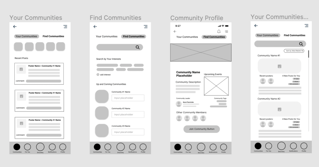
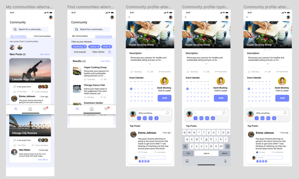
My team started the prototyping phase with simple paper prototypes. We divided the main features of the apps between each team member, individually paper prototyped these features, and conducted usability tests on these low fidelity prototypes. I was responsible for the Social Communities and Events feature.
This feature had three major requirements:
- Content from the communities a user has already joined.
- Ability to search for new communities.
- A way to connect with specific members of the communities.
Here is a video of the paper prototype for the “Community” section of the app.
After conducting usability inspections on our paper prototypes, we took these results and developed our wireframes in Figma.
And finally we established a style guide to provide a cohesive look across our features and started transforming our wireframes into higher fidelity and interactive screens.
The Iterative Process
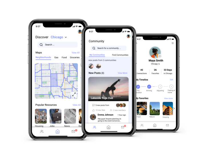
From sketching to creating the medium-fidelity prototype, our team knew that the discover page was a major feature of our app that would allow users to better understand their surroundings and find resources they needed for relocation. To reduce cognitive load of searching for resources, we designed a “For you” page that would provide personalized information based on user needs (such as job postings, housing listing, custom city news, etc.). Upon conducting usability testing, most users got confused because they thought the information in the “For you” page should have been on the “Discover” page. Additionally, there were major usability issues with accessing pull-up menus and important functionality on the “Discover” page.

The left screenshot shows early iterations of the “Discover” page. In this version, we focused primarily on a map feature and separated personalized information on a “For You” page. On the right is the final version of the “Discovery” page that has been merged with the “For You” contents.
Our group decided we needed to do a full design iteration on the “Discover” page in order to address these concerns. Our team did new sketches that reimagined our “Discover” page and made more clear interaction points that users found confusing. Through group discussion, we decided to collapse the “For you” content into the “Discover” page. This would make the “Discover” page more of a dynamic feed (including both a map and personalized information). After completing the design portion of the interaction, we evaluated our changes through peer criques during the discussion section. Our team referenced Interaction Design: Beyond Human-Computer Interaction throughout the evaluation process to create robust tasks for our users. These tasks helped us uncover core problems in our design in which we addressed with better design patterns that would better communicate functionality.
Potential Impact
Moving can be extremely stressful both physically and psychologically as it requires packing, making travel arrangements, understanding and adjusting to a new environment, etc., but @Home provides users with an abundance of necessary information and resources that can ease the transition. Not only will it make the physical action of moving less exhausting, but it can provide assurance and security by supplying housing options, job openings, and lists of logistics a person may need when moving. Additionally, as relocators utilize @Home, they can become more knowledgeable of their new surroundings, allowing relocators to be more comfortable in their new space and also pass the information along to others who may need it.
Although @Home aims at providing information and resources to anyone relocating to the U.S., there can still be groups of individuals that are excluded. For example, those who are relocating but do not possess a smartphone will not be as easily knowledgeable about the information that @Home provides. Additionally, @Home does not provide a feature to switch languages or a translation feature, excluding those who may not understand or speak English which can be especially difficult for individuals relocating internationally. It’s important to consider these implications to make interactive designs accessible to all groups as it can provide a more enriching and useful experience.
Here is the final interactive prototype demonstration. Enjoy!
What would I do differently?
Reducing Scope — Relocation is a huge topic and although we worked to define our scope, it would serve the user better to solve one problem well, instead of taking on too much. This is also important considering the short time line of which this project was accomplished.
Utilizing More Whitespace — Our problem statement was centered around reducing the stress and overwhelmed feeling relocation can cause. Adding more whitespace and simplifying the design would really help the app address this problem better.
Detaching from Bias — Our team struggled with giving up the concept of having a physical kiosk after learning this would not best fit the users’ needs. While we learned to be adaptable, I think it is valuable to go into a project without a set solution in mind.
